Since 1898, the visual identity of the American paper manufacturer International Paper has been marked by the presence of the spruce tree on its logo, an essential resource for its business. For its 125 e anniversary, the 39,000-employee group is getting a new look to better " reflect its strategic vision" with a logo where the resinous seems to be absent.
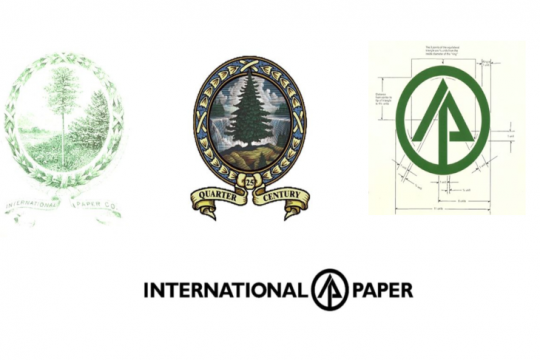
At first represented as puny in 1898, then majestic against a background of waterfall and forest in 1923 and in a graphic way since 1960, the tree has always been at the center of the group's image.
The new visual, in two colors, radically changes the form and content, as explained by International Paper.
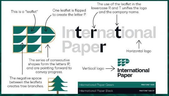
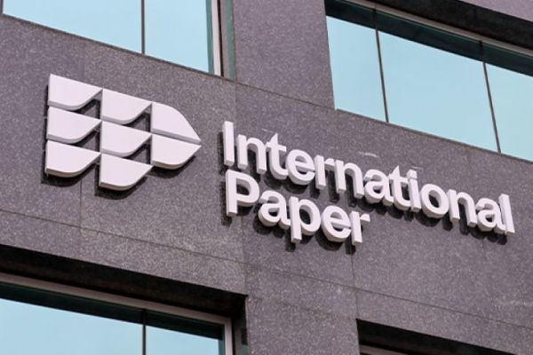
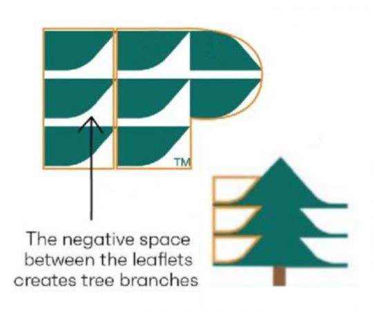
No more circles. Today, eight green stylized leaves are represented, forming the letters I and P.
The two leaves on the right form an arrow illustrating forward movement and growth. The letters and arrow are a nod to the company's previous logo, which also featured the I, P and arrow hidden in the tree by designer Lester Beall.
International Paper says its new identity "embodies a renewal that creates energy and optimism and marks a new important step in its evolution". But he did not forget the spruce for all that.
A spruce still very present
But then where is it? Well, between the euro leaves! The space between them represents the branches of the tree and lets guess the silhouette of the tree.
According to the company, "this new visual identity highlights International Paper's resilience, sustainability of its mission and commitment to creating the future."
Mark Sutton, president and CEO of International Paper, states: "As we open a new chapter in our history for the next 125 years, we move forward as a company committed to the present and the future, serving our stakeholders."
