Fisher-Price, the leading American brand of toys for babies and toddlers, is changing its logo and marketing strategy. The design studio Pentagram was commissioned to refresh its visual identity and the American advertising agency Wieden + Kennedy defined its new brand strategy.

The toy manufacturer created in 1930 by the Mattel Group wanted to, among other things "to be less prescriptive about child development." and emphasize the fun of the game. This has been transcribed in the new slogan: Let's be kids (which can be translated as "Soyons des enfants", the French version is not yet available). Since 2014, the slogan was Thousand and One Ways to Wake Up.
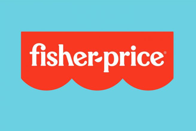
The Fisher-Price logo centered on the bright red curtain
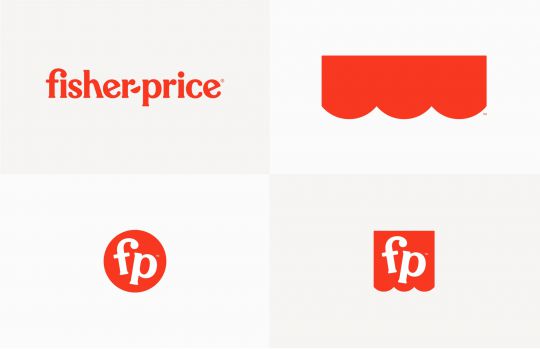
Pentagram's new branding refines the visual identity and extends it to a kit of graphic elements that gives Fisher-Price the flexibility to adapt to many environments.
The new logo is centered on the bright red curtain. It is now composed of only three semi-circles (as opposed to four previously) and its geometry becomes the basis of the new graphic design," explains Pentagram. (Internally, the redesigned canopy also symbolizes the three founders of the company: Herman Fisher, Irving Price and Helen Schelle)
The main logo is accompanied by two monograms, a bubble and an abbreviated version of the awning, both with the initials of Fisher-Price.

The awning can be used as a graphic icon to be placed anywhere - attached to the slogan typography, hidden in promotional illustrations or used on packaging.
A new refined but offbeat typeface
The logo has been redesigned in lower case, with letter shapes that are slightly more refined than the original, but still offbeat, according to Pentagram. "The hyphen between the names is now a semicircle, echoing the scalloped edge and the smiles on the faces of the Little People.. (figures from Fisher Price, editor's note)," says the design studio.
The new wordmark is in a font specially designed for Fisher-Price called Let's Be Glyphs. Let's Be Glyphs is a semi sans serif that echoes the original Fisher-Price font (which was based on the Windsor typeface).

The joy present throughout the visual identity
"The colorful graphics and custom typography capture the brand attributes of fun, action, play, party, stupidity and joy." explains Pentagram.
The joyful aspect is present throughout the visual identity of the brand (print and digital advertising, retail merchandising...).
And Pentagram has established new guidelines for art direction in photography to emphasize play, imagination and children interacting with their families.
"The new message aims to create an emotional bond and to recreate the feeling consumers had when they played with toys as children and to make them want to continue playing with them".


