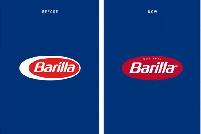
The new Barilla logo
for its 145th anniversary, a total red look and a slight facelift on the typeface, redesigned by the Milanese agency Robilant the new logo, which was designed to be more timeless for the famous Italian brand, is a deliberate choice. The mention " Since 1877 "Barilla's presence in Italy since the beginning of the food industry.
On the old logo, the white of the oval symbolizes egg pasta. The opening of the brand over time to the diversification of its products, also justifies an update of the visual identity.
also noteworthy, the elimination of plastic on most new packaging to reduce waste processing.
"Al Bronzo", the new Premium range
The packaging is dressed in red, a unique color on the market, according to the brand's wish to to convey the passion the stamp on a blue background is based on the symbol used on the very first Barilla packaging, which is one of the company's strongest values. On the front, the stamp on a blue background reproduces the symbol used on the very first Barilla packaging.
Currently sold at Monoprix in world exclusivity the new premium pasta line, "Al Bronzo" is scheduled for national release in April 2022.
And in keeping with our commitment to the environment, the cardboard packaging is manufactured using more environmentally friendly processes.
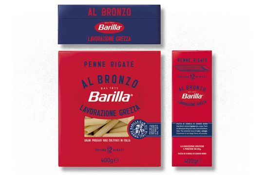
A new product experience
With Al Bronzo barilla's goal is to reach the position of leader in the premium segment that is, to climb two places.
Miloud Benaouda, President Western Europe of Barilla, says: " This is the most important launch in the last ten years for Barilla. The Al Bronzo range illustrates a new vision of the pasta category and offers a new product experience. "
