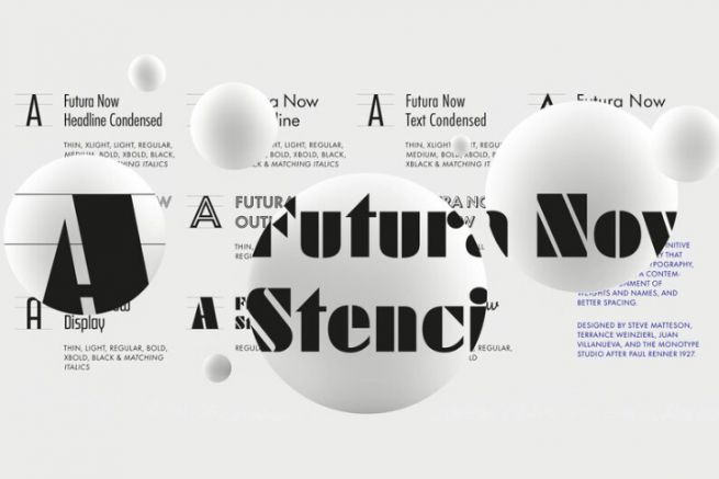
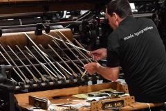
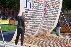
Even icons need to renew themselves. The Futura typeface created by Paul Renner in 1927 was redesigned by the American foundry Monotype. Named Futura Now, this latest version remains faithful to the original one created for the German foundry Bauer Types, while acquiring a more contemporary typographic palette.
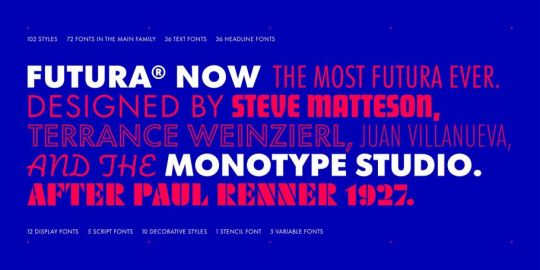
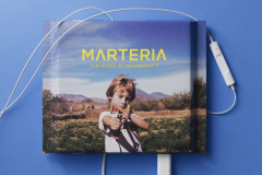
Particularly popular, the Futura geometric linear font has inspired many other fonts and has been widely used on a variety of media.
It is present in films (in the credits and sets of The Tenenbaum Family by the American Wes Anderson in 2001 or the credits of Les Tontons flingueurs by the Frenchman Georges Lautner in 1963 or the poster for Interstellar in 2014 by the American-British Christopher Nolan).
It also appears in logos (of the New York streetwear brand Supreme for example), in many advertising campaigns (of Volkswagen or HP) and even on the Moon, on the aluminium plate put down by the astronauts in 1969.
But, according to Monotype, the font has lost its authenticity over time: the very rapid changes in typesetting technology and the numerous updates of digital versions have gradually deteriorated the original design.
The foundry has therefore reworked this font in order to correct these approximations, adapt it to new uses while trying to bring to the timeless design "Contemporary sophistication" she explains on her website.
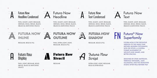
"Futura Now is what Futura needs in today's demanding typographic world, with a contemporary palette of weights and variable font files for infinite interpolation."
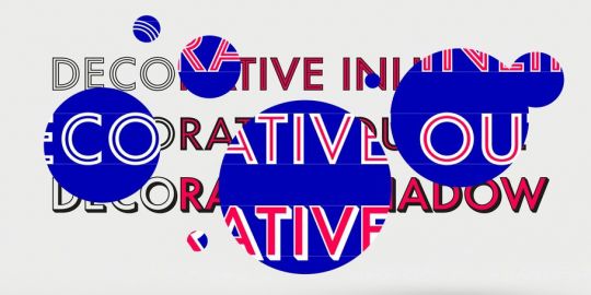
Futura Now includes 102 styles, 89 alphabets, including 600 characters as well as new weights, decorative variants, scripts and even a variable font.

