1) Create a tree structure and a simple navigation
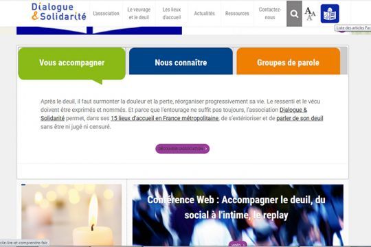
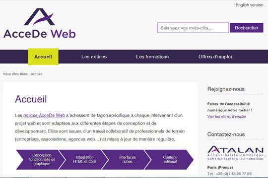
When creating a website, it is important to plan its use on multiple platforms: computer, tablet, smartphone. The navigation must remain simple and intuitive, whatever the size of the site, for the comfort of all Internet users. Thus, clickable areas such as buttons should not be too small and sufficiently airy to facilitate the user experience.
2) Fill in the description tag (Alt) of the visuals
Images must be accompanied by an alternative text that will be read by the various assistive technologies used by people with disabilities. The same goes for any non-textual element: form, link, button, for example. Without this step, the target cannot understand the content of the page, gives up or misses certain information.
3) Select contrasting colors to design the interface
The background and foreground are much more readable (and therefore, accessible) if they respect a good level of contrast. However, even if black and white are undoubtedly the best values, the richness of the color wheel fortunately allows for adapted creativity. To check if the contrast of a page is sufficient, several tools exist:

4) Navigate without the mouse
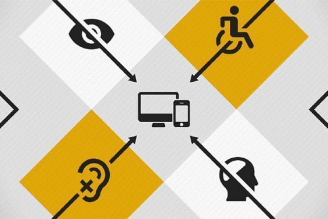
Some people with disabilities cannot use a mouse and only have access to the keyboard. It is therefore essential to test the navigation under the same conditions to validate the interactive elements.
5) Test the site with the populations concerned
Ideally, testing a website with a representative panel of users will highlight the pluses and minuses of its accessibility level. However, the tool Wave also allows to control and analyze the comprehension of a site towards a handicapped public. It checks:
- contrasts and colors;
- aRIA LABELS;
- the structure (header, navigation, main, titles, etc.);
- clickable areas.


