Mr. P., the Pringles mascot, gets a facelift
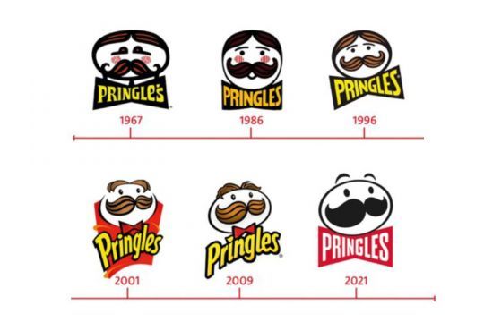
More expressive, more easily adaptable and still as identifiable, Mr. P. is changing its look in France from January 2022. His new bow tie is more voluminous, integrating the brand name and giving the ensemble an even more striking look.
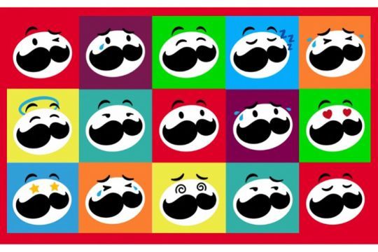
Happy, sad, hilarious, in love, (...), Mr. P. comes alive with different emotions to surprise and amuse the 18-35 years old target.
« Mr. P's colorful new pop design gives our mascot a dynamic style and reflects the fun of our brand. This new look perfectly embodies the Pringles identity and the iconic character of our tiles that retain the flavors our consumers know and love. "says Marie Kretz, Senior Activation Manager at Pringles.

The packaging of the famous cylindrical box, the "Cans", has also been revisited. More modern, it is rid of superfluous elements to stand out more on the shelf.
Between now and the end of the year, a major multi-channel communication campaign will announce this change and promote the brand in a highly competitive environment:
- social networks ;
- tV and digital campaigns;
- POS.
The birth of the Pringles visual identity
The Pringles mascot is derived from the caricature of a baker named "Julius Pringles" by the brand and personified in the first TV commercial of the saga starting in 1973.
The potato-shaped head, the generous moustache and the bow tie are the 3 immutable elements of the logo.

And as is often the case, when it comes to a change of visual identity, opinions are divided. On the web, the success of this graphic facelift is not unanimous:
- " What is this? Since when does simplifying mean taking out all the character? Logos are getting more and more boring " ;
- " Mr. Pringles got his hair cut (...) in the new logo. He doesn't look as nice. It looks like a forgery " ;
- " I really like this rebranding. They have managed to keep the distinctiveness of the Pringles brand while making it more versatile and modern. "
The name Pringles The name "Pringle Avenue" was found by chance in 1968. Lacking inspiration when brainstorming, P&G (the original manufacturer) creatives flipped through the Cincinnati phone book and were seduced by the sound of "Pringle Avenue".


