Its origins
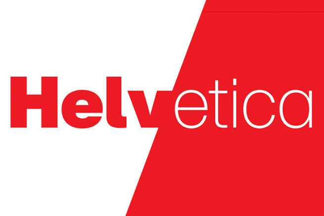
Created in 1957 by the Haas foundry in Switzerland, Helvetica reflects a new ideal after a period of conflict, a neutral, orderly and clear world, with its clean and harmonious lines. Its designers, Max Miedinger and Eduard Hoffmann, were inspired by the Grotesk typeface to create a simpler, more elegant typeface that could be used for many purposes. The success is immediate. Efficient, modern and all-purpose, it quickly found its way onto all media:
- traffic signs ;
- washing tips on clothing labels;
- film subtitling ;
- Miss Universe sash;
- new York subway, etc.
Ultra legible, it has been adopted for the design of many logos such as Evian, Lufthansa, Post-It and Toyota. American Apparel, adept of the "no logo" signs its basic look in Helvetica.
A cult typeface, but discussed
euros by dint of appearing everywhere, it ends up annoying. The 70's shook up the surrounding conformism and rejected the too rigorous shapes of Helvetica. Numerous graphically opposed, round and psychedelic fonts then flourished.
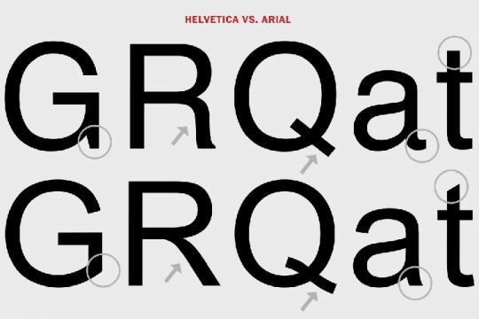
The 90's marked the return of this typeface family, notably thanks to its optimization for the web. But the license to use it remains expensive. Even if Microsoft uses it until 2012 for its corporate identity, the firm prefers to substitute Helvetica for Arial in its software suites.
Despised by some, admired by others
Too neutral and too self-effacing for the benefit of the visual, it is not suitable for messages that need eloquence. However, there is a community of graphic designers who are absolute fans of Helvetica and who are doubling their creativity to design products using it, even turning it into a brand. Drinks, clothes, perfume, everything goes through it! Neutral doesn't mean value-free and Helvetica is a perfect font to communicate a commitment to tradition, legibility, timelessness, design and Swiss excellence.
- The Monotype foundry, owner of Helvetica, has developed a collection of cycling clothing in Swiss colors;

- The Helvetica perfume, imagined by a design agency and sold at its release for $28, smells like nothing, as it is composed only of distilled water. An absurd wink with a collector and offbeat packaging;
- The (red!) Helvetica wine is light and suitable for everyone;
- Helvetica Mountain Pionners is a brand of clothing for mountain and winter sports, wanting to claim its Swiss roots;
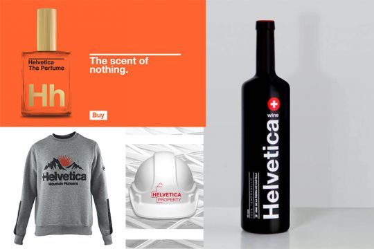
- Real estate asset management: Helvetica is also a Swiss company specialized in real estate assets. Its first logo combined the typeface, the red and the cross;
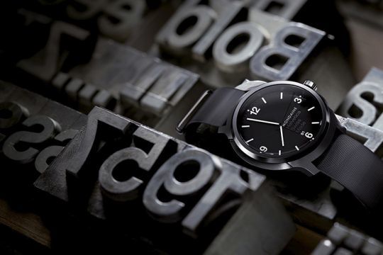
- The Helvetica watch, created by the Swiss brand Mondaine, exists in three models, light, regular and bold depending on the thickness of the signs on the dial.
Neutral, but not meaningless, Helvetica in the graphic industry should not be chosen at random. Isn't staying neutral already taking a stand?
