1- Simplicity and geometry
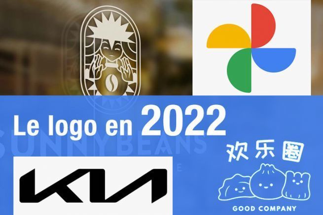
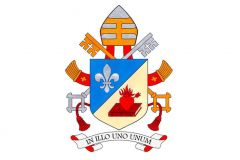
The micro logo, composed of basic geometric shapes, allows to obtain a concise and fresh image, reduced to the essential. This makes it easier to remember the brand. KIA or Google, for example, have already opted for the well-known principle of "Less is more".
2- Verticality
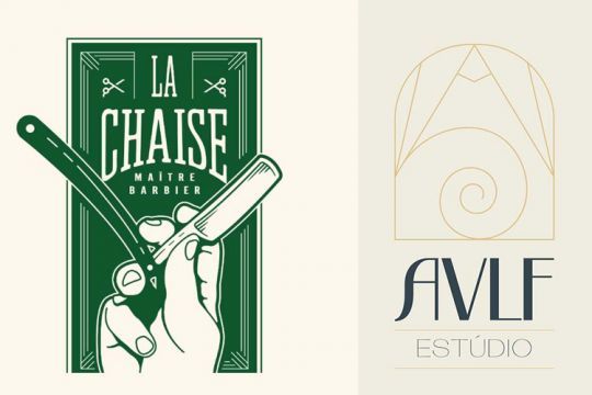
Large vertical logos, particularly suitable for the fashion and retail sectors, as well as for companies wanting to display a cutting-edge image, offer a real change in the graphic habits of visual identity. For online advertising, this tall format has the advantage of being compatible with the notion of responsive, without creating additional declinations.
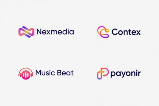
3- Saturation and color gradients
The game is to find the right balance between bright colors and simplification of details. Gradients are more and more present since 2020 (according to thedesignest.net).
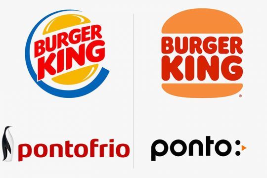
4- Symbolism and minimalism
Practical, unobtrusive and always readable, even on small spaces, the minimalist logo must be above all responsive rather than aesthetic. However, one does not prevent the other.
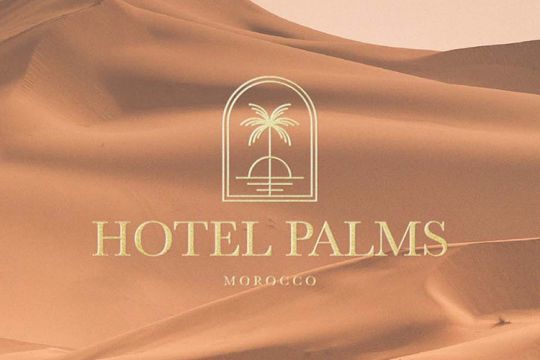
5- euros Against fine and detailed decorative elements
Always popular, the Scandinavian and bohemian-inspired styles of logos using floral motifs can be found in various fields of activity, independent of floristry:
- furniture;
- stationery ;
- clothing;
- stores ;
- cafes, bars, etc.
6- Sketches & roughs
Hand-drawn sketches, mascots and stylized shapes are making a comeback in 2022. These almost unfinished-looking logos are back in style in 2015.
7- Wordmark
Google, Coca-Cola and Visa, for example, use wordmark logos. Bold, geometric and uncommonly proportioned, the experimental and trendy typography reflects, among other things, the brand's aesthetic.
8- Characters without serif
With the huge variety of sans-serif fonts, their variations and their great compatibility in very diverse sectors, this typeface style joins the minimalist look of the moment, without ever falling into monotony.
9- Black & White
Versatile, minimalist and of course, elegant, the black & white logo combines with all the graphic styles mentioned above. We validate the trend!
10- Flat Design
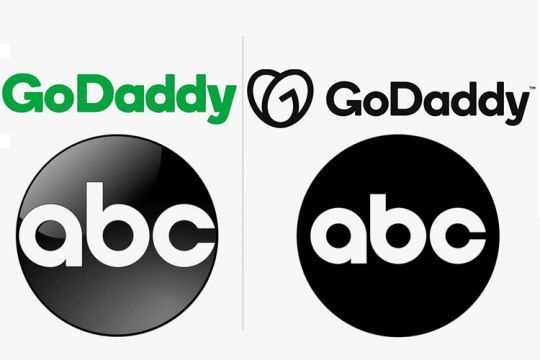
Whether you like it or not, flat design continues its progression in logo design. However, it seems that brand identities designed in flat design are evolving towards a 3D effect and vice versa. Isometric art, based on optical illusions, bright colors, gradients, etc. is also interesting to represent a company.
