A recent study on the emotional influence of typography conducted at the end of 2022 by American foundry Monotype in association with Neurons, an applied neuroscience company, highlights the importance of the choice of typography in facilitating the understanding of a message and provoking the desired emotions.
Typography, a story of character and emotion
All those involved in visual communication play with typography, which is recognized as an essential emotional vector and part of the famous act of purchase or decision.
Marie Boulanger, Brand Designer at Monotype, who initiated the study, explains: "It's well known that brands rely on typography to convey values such as trust and reliability. We wanted to put this assumption to the test and quantify the emotional value that typography can bring to brands and their audiences."
Three fonts put to the test
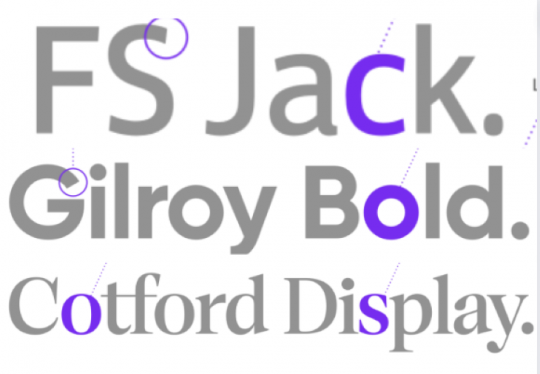
To carry out the study, Monotype and Neurons interviewed 150 French people using isolated words presented in three fonts: FS Jack, Gilroy and Cotford.

The results confirmed that typography plays an essential role in conveying the emotions of trust, sincerity and reliability, even in the absence of color, logo or visuals.
The choice of font increased positive responses by 13%. Even Neurons was surprised to get such high results, since the company usually records responses between 0 and 5%.
One of the findings of the study was that Gilroy Bold is associated with quality. The word written in Gilroy Bold was judged more honest, more memorable and more trustworthy than the other two typefaces.
The FS Jack font also remains a relevant choice, with results close to those of Gilroy Bold.
The word trust gets a better response when written FS Jack.
As for the word innovation, it is perceived as the most honest in Cotford.
The study also shows that, regardless of typographic choice, the word innovation is perceived as less honest than the word trust.
Different results in the UK
Monotype and Neurons had previously carried out a more detailed study in the UK. The results show significant differences between the two countries.
For example, unlike in France, it was in Cotford Display Regular that the word "Quality" was deemed more relevant, memorable and trustworthy by those surveyed.
"The differences between the results obtained in France and in the United Kingdom clearly show the extent to which two cultures, geographically close, can react differently to typography and to words" notes Damien Collot, Creative Director of Monotype
These wide disparities suggest that "we've only scratched the surface of the relationship between caracteÌeurosres and eÌmotions. This illustrates the importance for design-led companies to look beyond language change when developing localization strategies." according to Mike Storm, COO of Neurons.
Other similar studies are planned by Monotype in countries such as Japan and China as part of a research project on design support tools for brands and designers.


