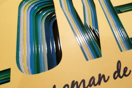
Frankly in Love and us aussi?! This novel by David Yoon released in March 2020 in France is presented with a superb cover that catches the eye as much as it does the mind. This trompe-l'oeil illustration was created by the English graphic designer, illustrator and decorator Owen Gildersleeve, who gives us a behind-the-scenes look at this work..
Owen Gildersleeve, who has made paper cutting his speciality by creating superimposed planes and plays of light and shadow, was contacted by the Penguin Random House publishing house a few months ago. They wanted him to design the cover of David Yoon's first novel, Frankly in Love. This first novel by the Korean-American tells the love story of Frankly, a teenager torn between his Korean heritage and his American upbringing.
The brief was to reflect the themes of the novel namely ethnicity, romance and cultural identity through the use of typography "in an energetic and daring style." he explains .

Owen Gildersleeve began by creating a custom typography. Used diagonally on the cover in order to convey a certain dynamic, the typeface was cut many times, meticulously with a scalpel, from different coloured papers.

He then laid these papers one on top of the other, interspersing pieces of foam of different thicknesses to create distinct planes. These multicoloured layers that the cut-out reveals make "referring to the complexity built around the relationships and cultural identity of the main character".. .
Finally, Owen Gildersleeve photographed this montage in his studio using natural lighting. 

"It took me a few weeks to design and build, with several trips back and forth with the author" he says.
And during production, the illustration was further enriched with a selective relief varnish on the letter cut-outs, underlining the different planes of the work and reinforcing the perspective effect. In the American work, the edges of the book are decorated with a beautiful dark blue.

As soon as it was released in the United States, the cover was noticed and several publishing houses contacted Owen Gildersleeve to create language versions of the novel.


