The new Volvo logo
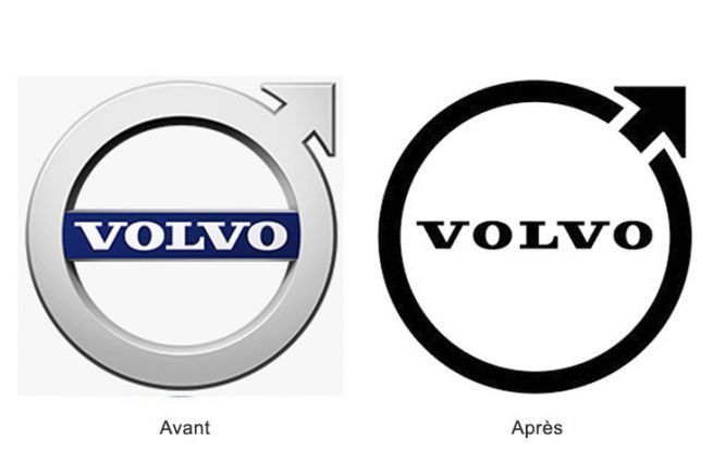
Recently simplified to the maximum, Volvo's new logo now follows the characteristics of flat design, as its competitors Fiat, Nissan, Volkswagen, etc. have already adopted. If this graphic trend is so attractive to the automotive sector, it is not only to use a visual identity that can be easily transposed digitally, but also for its industrial interest on the bodywork.
The simplicity of the circular shape, emblematic of the brand, and the arrow pointing to the sky are kept and refined. The typeface also remains unchanged. Only the relief and material effects have disappeared, as well as the blue band.
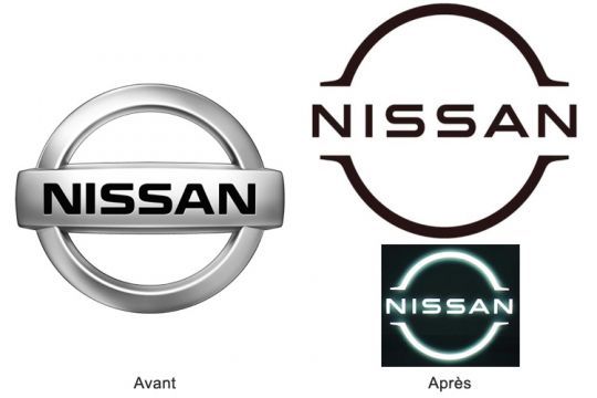
The Nissan logo
The Japanese manufacturer has therefore previously chosen the flat design format to communicate graphically. The futuristic look of the coat of arms, split in two by the lettering and a neon effect, meets the same ambitions as Volvo.
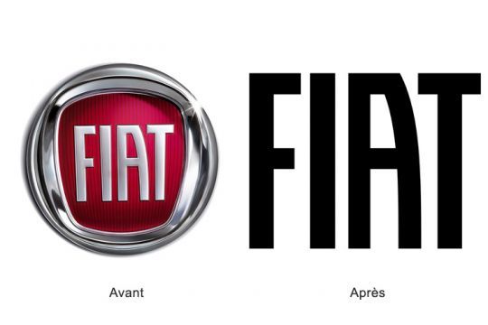
The Fiat logo
Gone are the chrome finishes, the 3D and glossy effects. Minimalism is unmistakable with the new Fiat logo, keeping only its name. Effective, it also gains in modernity and remains recognizable at first glance.
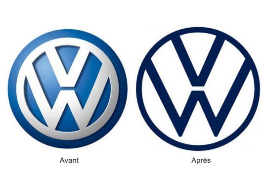
The Volkswagen logo
Themes of the future and modernity are common to manufacturers and Volkswagen is no exception with its new monochrome logo. The conquest of the electric vehicle market is pushing creative designers to go back to the basics, supposed to represent a new era.
