Creativity for inclusion
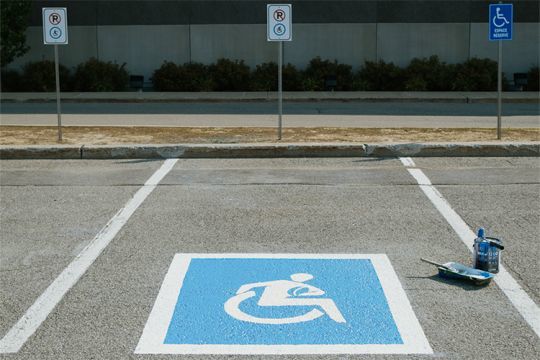
Created by Susanne Koefoed, a Danish design student, in 1968, the pictogram indicating accessibility for disabled people has been redesigned in a sports version under the eye of Decathlon. The brand is committed to including all profiles of the public in the practice of sport and makes it known through original signage that speaks for itself.
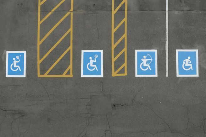
The logo is therefore adapted on parking spaces of some of its stores and represents the avatar in a game situation. Rugby, archery, basketball and tennis are the four sports added to the internationally recognized graphics. They also illustrate the disciplines defended by the Canadian team at the Tokyo Paralympic Games in 2020.

See further with Decathlon
Limited to the Canadian territory, this campaign entitled " Symbols of the possible "This campaign was designed with the communication agency Rethink. It would benefit from being extended beyond the continent, so strong is Decathlon's desire to change people's perception of physical disability. However, an event website published for the occasion, abilitysigns.ca, offers the possibility to download these new models, with the aim of sharing them and appropriating the main message to create new ones.


