Since March, Adobe branded products are presented with new logos. The Californian publisher explains on its blog this new identity whose deployment will be completed in the coming weeks.
"Adobe offers a wide range of products for different audiences with different needs. (...) We have decided to change our branding to keep our entire product portfolio simple to navigate and understand, while adding a modern twist."
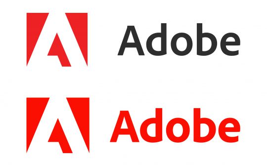
Among these multiple changes, we can mention the Adobe Group logo, which had not changed since 1993. It has been slightly modified to be more functional and to adapt to all formats and media. The black of the typography disappears, and from now on a single colour makes up this logo.

"We've opted for a monochrome logo, with a red color that we want to be warmer and more contemporary."
The Creative Cloud logo, previously red and white, is now multicoloured. It includes the colour codes of all its products as well as the new red Adobe logo. The gradient between these shades represents "the importance of creativity" .

On Creative Cloud logos and all products, the right-angled corners of the logo shape disappear for rounded corners and the coloured border is also removed.
"When it comes to product logos, we will use our two-letter system for our entire range of solutions (Ps for Adobe Photoshop, for example), and we will add a third letter to make it easier for customers to identify products within a certain range (Ps for Adobe Photoshop and PsC for Adobe Photoshop Camera, for example)."

With this new identity, Adobe uses colour to identify the type of creations of its products (e.g. video and animation, photography, etc.).


