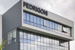
The Italian manufacturer of creative papers and self-adhesive label materials Fedrigoni is now presenting itself under a new visual identity. Created by Pentagram, this identity harmonizes the 15 brands that have successively joined the group and brings together its two business sectors.
"This is an important goal for the growth plan of this company, which is now the third largest global player in the premium self-adhesive labels and materials segment." emphasizes the group.

London-based design studio Pentagram has renamed Fedrigoni's self-adhesive materials division Arconvert Ritrama, which brings together Arconvert, Ritrama (acquired in February 2020) and IP Venus (acquired in December 2020) . This division is now called Fedrigoni Self-Adhesives.
As for the group's logo, Pentagram has retained the shield, which includes the traditional ladder motif and the company's founding date of 1888, "fundamental element of the Fedrigoni brand" .

The French typeface Peignot (revisited version) is replaced by the Italian typeface Forma, created in 1968 by the typographer, Aldo Novarese. The Forma typeface had been used by the London studio Graphic Thought Facility (GTF) for the Paper Box, the Fedrigoni paper catalog launched a few months ago .

"The Forma typeface perfectly represents Fedrigoni's overall identity: strong, bold and confident, with a powerful reference to its Italian roots. Moreover, it is legible and functional." says Harry Pearce, partner at Pentagram.

With this new communication, the paper manufacturer has adopted a baseline: "Elevating Creativity". "Our mission is to "elevate creativity": the ladder, symbol of the city of Verona, is also our icon that represents our commitment, through our products, to help all customers maximize and elevate their brands." emphasizes Marco Nespolo, the CEO of the Fedrigoni Group.


