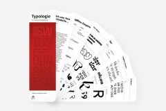
The Pyramyd publishing house releases its beautiful book of 2006 The Harmony of Colors in pocket format.
This short guide by Tina Sutton explains how color harmony works and contains color palettes arranged by theme. Its teachings can be applied to graphic design, interior design, design, styling, art and any other discipline involving the visual.
The book begins with the presentation and explanation of terminology and concepts related to color, such as the color wheel or the 10 basic combinations (neutral, separated, contrasted, tertiary ...).
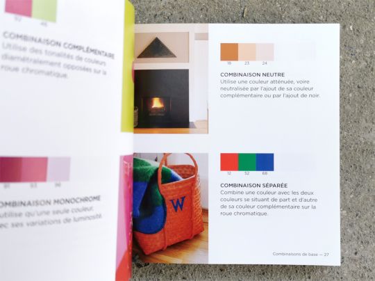
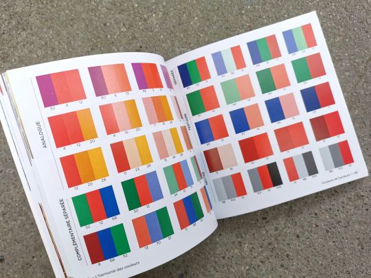
Then are presented 1500 harmonious combinations of colors. These palettes of one, two and three colors are classified according to the emotional or aesthetic "mood" they emit, such as strength, elegance, freshness, tropical, movement, friendship, softness or tradition.
Each series of colors is introduced by a text that summarizes the characteristics of the mood. For example, wealth will be expressed by burgundy shades. Combined with gold and green, they will evoke financial power.
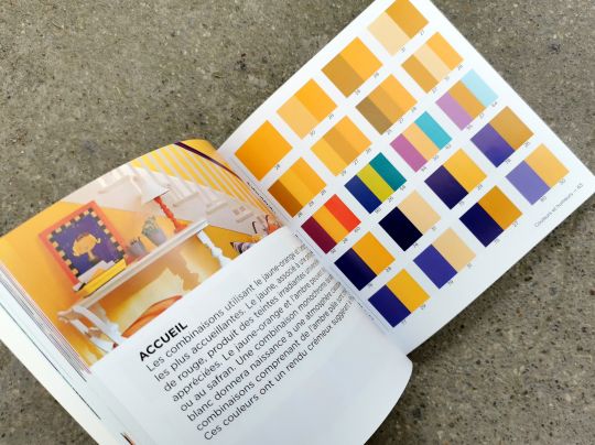
The Harmony of Colors pocket edition, by Tina Sutton, published by Pyramyd, March 2021, size 13 x 13 cm, 192 pages, 14,90 euros


