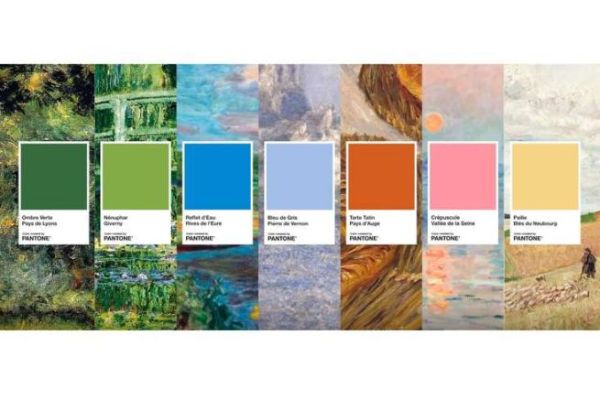
Impressionism, a movement born in 1874, found fertile ground in Normandy. The Eure region, in particular, inspired major artists such as Claude Monet, Auguste Renoir and Camille Pissarro. Today, this land of inspiration is honored by a unique collaboration between the Eure department and the Pantone brand, with the creation of the "Première Impression" color chart. Comprising seven emblematic shades, this color chart evokes the beauty of Normandy's landscapes, while paying tribute to the Impressionist masters.
This artistic initiative, through the "Première Impression" color chart, invites art and nature lovers to rediscover the landscapes of Eure in a new light. More than a tribute to the Impressionists, this collaboration between Pantone and the Eure department paves the way for a new approach to territorial marketing, where art becomes a lever for cultural enhancement. Beyond this anniversary, other artistic collaborations could see the light of day to continue celebrating the visual and emotional richness of Normandy.
Nature, the main source of inspiration
Impressionism, often described as a movement that captured light and emotion, was nourished by the natural landscapes of the Eure. One of the key colors of the palette Pantone 7743C named "Ombre Verte", is inspired by L'Allée au bois by Renoir. This deep green conveys the serenity of the forests of the Lyons region, ideal for painters in search of light. This hue perfectly illustrates the importance of nature as Impressionism's first muse.
Water reflections and bucolic atmospheres
The color Pantone Process Blue C entitled "Reflet d'Eau", pays homage to the banks of the Eure, and more specifically to Vernonnet âeuros Landscape near Giverny a work by Pierre Bonnard. This brilliant blue captures the essence of the Seine meandering through fields and villages. It reflects both the sky and the fleeting emotions so characteristic of Impressionist work.
An immortalized architectural heritage
Visit Pantone 651C named "Bleu de Gris", evokes vernon Church by Claude Monet. The color captures the rough texture of Normandy stone and the way it reacts to light. More than just a color, "Bleu de Gris" symbolizes the encounter between historic architecture and natural landscapes. Monet, who often painted the churches and villages of the Eure region, found a continuing source of inspiration there, transposed here in this timeless hue.
Warm, gourmand colors
Visit Pantone 7583C named "Tarte Tatin", takes its name from a famous painting by Claude Monet, Les Galettes . This caramel brown is reminiscent of baked apples, an essential part of Normandy's gastronomic culture. Beyond the pictorial aspect, this color also evokes the agricultural lands of the Pays d'Auge, known for their local products such as calvados and cider. "Tarte Tatin" thus illustrates the harmony between art and delicacies, two facets of the Norman identity.
The subtle play of twilight
With the Pantone 3572C called "Twilight", Pantone captures the essence of Setting sun on the Seine at Lavacourt, winter effect by Claude Monet. This warm hue, oscillating between orange and red, embodies sunsets over the Seine valley. This unique moment in the day, when light envelops the landscape in a golden veil, often inspired Monet. The color "Crépuscule" immortalizes this magical moment when nature and light combine to create unforgettable paintings.
