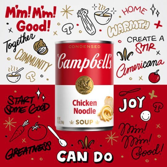
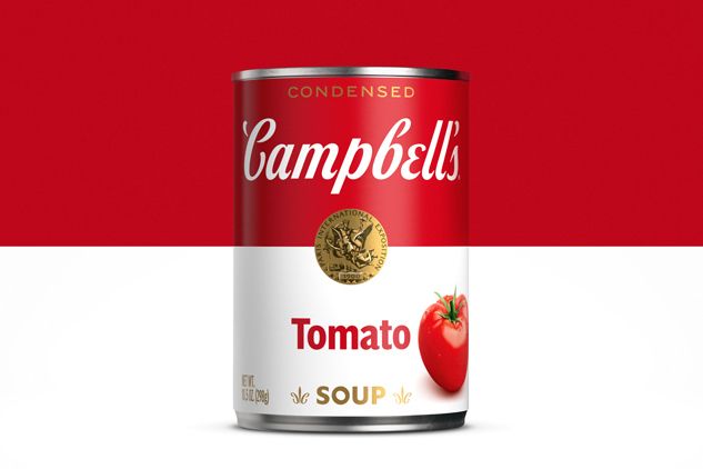
The Campbell's soup can, made iconic in the 1960s by artist Andy Warhol, is getting a makeover. The American company Campbell Soup Company presented in July a new packaging, whose design, logo and typography are signed Turner Duckworth in collaboration with Ian Brignell. This is the first packaging change in 50 years.
While the iconic red and white block has been retained, the label has been revamped with several new elements designed to make the brand more contemporary while respecting its heritage (the first red and white label dates back to 1898). Campbell's fans will be able to spot elements such as the Campbell "C" in the fleur-de-lis and the slanted "O" in the soup.

Campbell's embraces digital art
To celebrate this new label design, the company also launched its first NFT (nonfungible token), which refers to a certificate of ownership of an intangible work, available only online. This new practice, very popular in the art world, exploded in the United States during the lockdown.
The collection of 100 authenticated NFT artworks entitled "AmeriCANa" was created by street artist and illustrator Sophia Chang. "Some of the most famous pop art ever created was inspired by Campbell's red and white can - the design is as much a staple of the grocery store aisle as it is of American culture." explained the artist.

Proceeds from Campbell's NFTs are donated to Feeding America, one of the group's partners in the fight against food insecurity.


