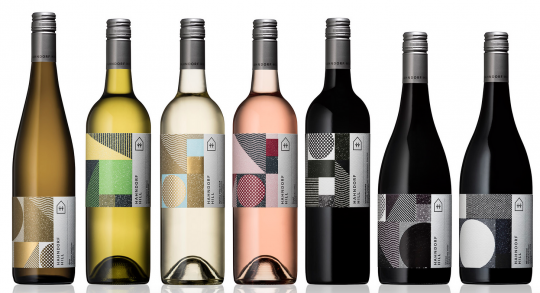
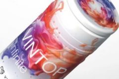
Like clothing fashions, graphic trends in packaging design are part of an eternal renewal. The field of labels, and more specifically that of wine and spirits packaging, is seeing the return of a long-forgotten fashion, that of "maximalism".
Manon Favier is a doctoral student in marketing at the University of Angers. She studies the influence of graphic design of packaging on consumer perception and behaviour. Her research focuses on different sectors, including wine. She explains how two major trends, which she describes as "maximalism" and "minimalism", coexist today on the wine label market.
"The heyday of minimalism in packaging graphic design was set in the 1960s. But in the last ten years or so, maximalism has returned, and the two styles are now coexisting." explains Manon Favier.
Minimalism VS maximalism
Minimalism corresponds to a desire to simplify labels. Goodbye golden backgrounds or friezes of grape bunches. We prefer clean designs with white spaces and sans serif fonts that facilitate legibility.
"Minimalism can be associated with rigour, sobriety, seriousness. But not all brands should opt for a simple design that may not suit their personality and identity."
Maximalism, on the other hand, offers an expressive aesthetic, focused on decoration, ornaments and all the elements that fill empty spaces while communicating about the brand, for example its historical roots or certain traits of its personality.
"It's a movement to address the relative consumer fatigue with minimalism." Manon Favier analysis. " For graphic designers it's interesting. While minimalism tends to impose empty spaces and thus reduce creation, maximalism broadens the creative palette of designers."
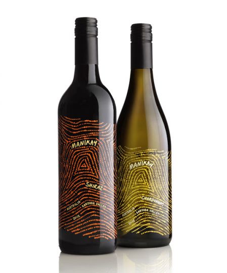
A more "festive" image for brands
According to Manon Favier, maximalism makes it possible to affirm certain traits of a brand's personality. For example, her research has shown that more complex visuals convey the image of a brand with more festive, joyful and convivial qualities, as opposed to the sometimes impersonal rigour and sobriety of minimalism.
Is this the return of the friezes of grape clusters and other very classiques?? Yes and no. If French wine labels remain generally rather classical, the opening with New World wines breaks the codes. Brands are reappropriating classicism by adding modern designs, original layout or flashy colours. In France, it is in rosé wine labels that we find the most fantasy.
Is it then necessary to throw oneself into maximalisme?? Not necessarily, answers Manon Favier. "Today's interest in brands is that they don't have to do what everyone else does. They have a number of choices depending on what they want to communicate to the consumer.
